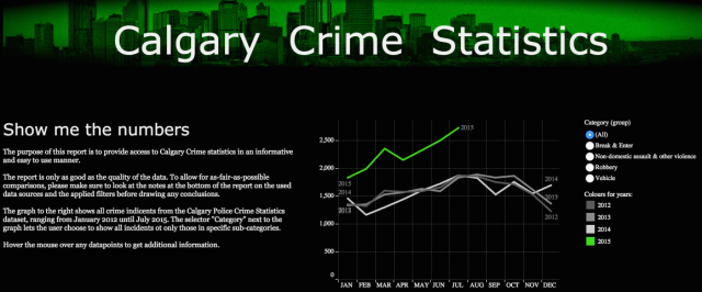
The Calgary Police Commission released its 2015 citizen survey results, in which they conclude that the Calgary police is highly valued and do an excellent job (see report here). As I have a lot of respect for the “(wo)men in blue” and the job they do I can relate to many findings in the report, but there was also a finding that struck me as odd: “One-half of Calgarians feel that crime has stayed the same over the last twelve months“. Of course this survey is about perception and not facts and numbers, and one cannot expect that all surveyed people are highly aware of their city’s crime statistics. But as someone in the middle of doing some analysis and visualization of those datasets, I wanted to share the crime statistics in a visual and easily consumable way. The dashboard unfortunately shows that crime incidents have strongly increased in 2015, with almost 16,000 crime incidents in 2015 until July (so seven months) compared to just under 19,000 incidents in 2014 (full year).
The dashboard is available on Tableau Public here (or click image below). As the embedding of Tableau Public dashboards in WordPress blogpost leaves a lot of room for improvement at this point the dashboard is not available in this post.

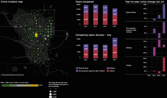
Before drawing any conclusions please have a look at the dashboard and read the Introduction and The data section.